
The company needed a website that signals a premium level from the first screen and eases the main worries about renovation: hidden costs, missed deadlines and lack of control.
GrisArt
LiveA website for a design-led renovation company working on apartments, houses and commercial spaces in Moscow and St Petersburg. Dark premium aesthetics and a one-tap cost estimate.
2languages — Russian and English
6service lines in one system
10portfolio projects with size and timing
1field — and the estimate request is sent
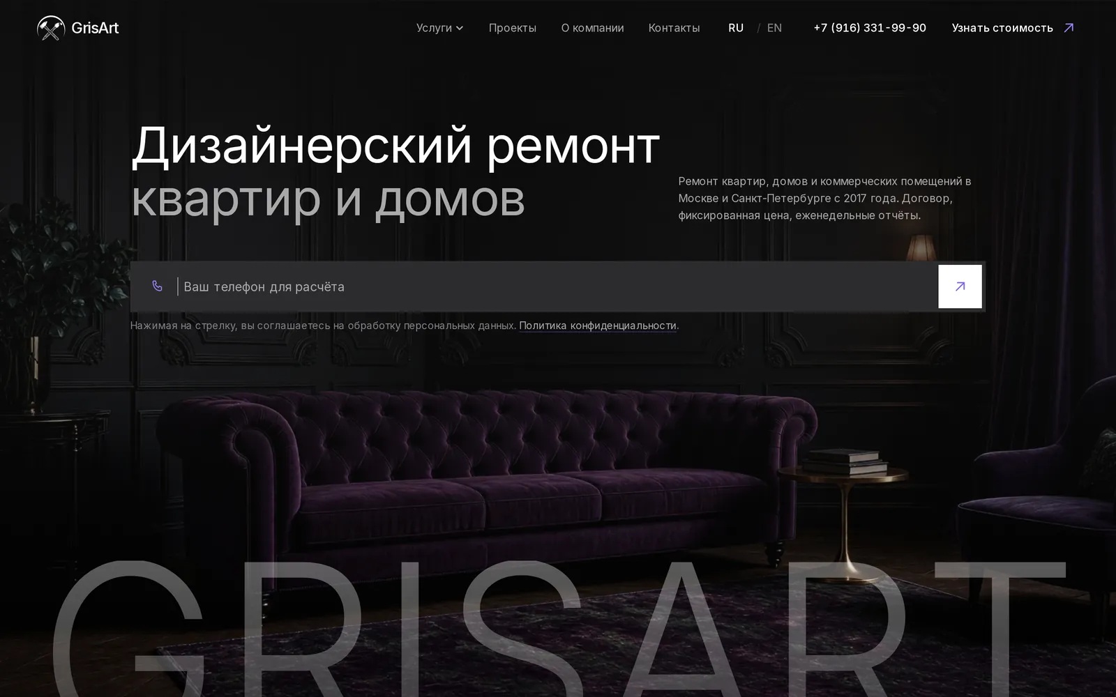
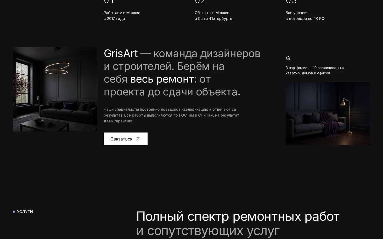
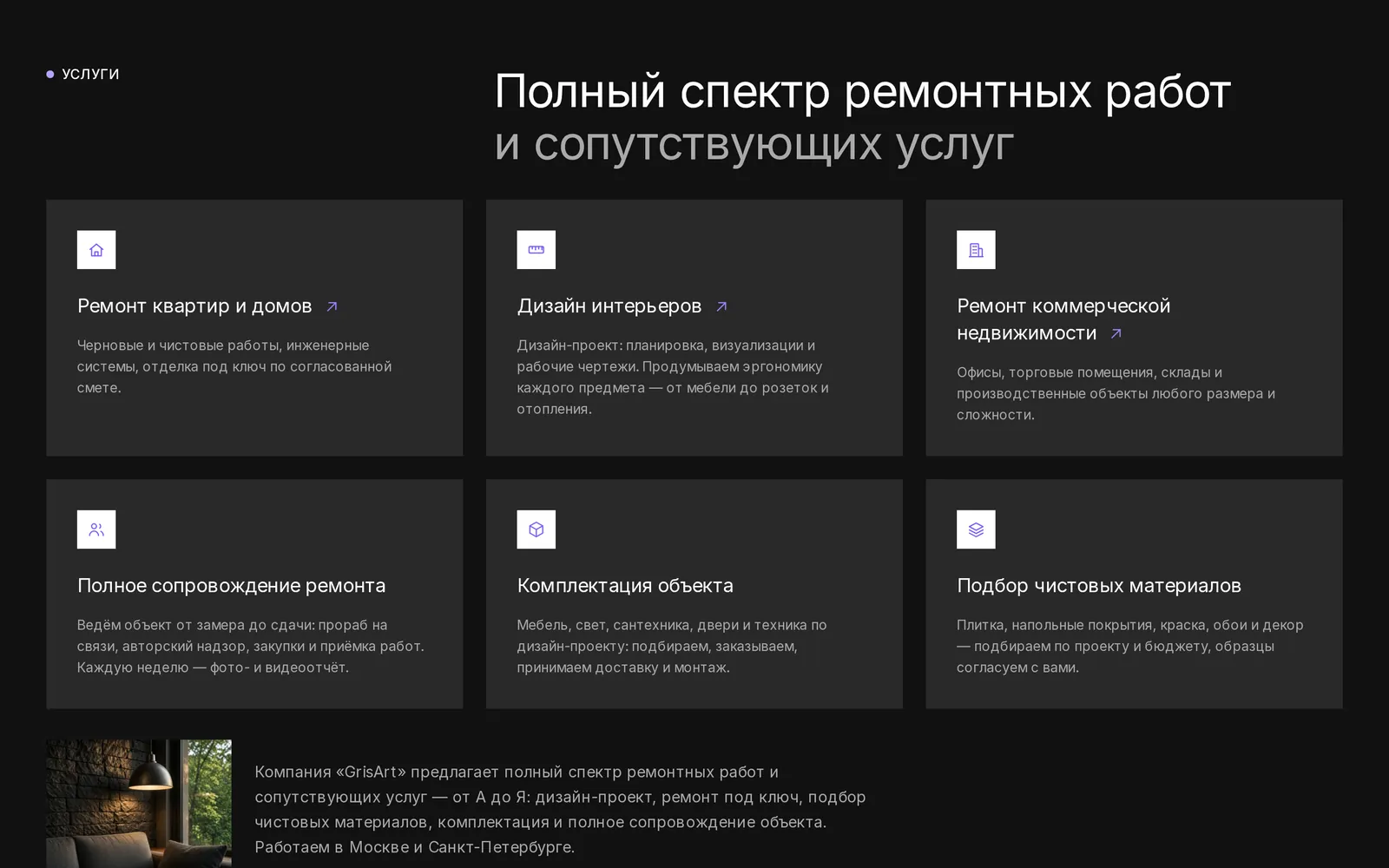
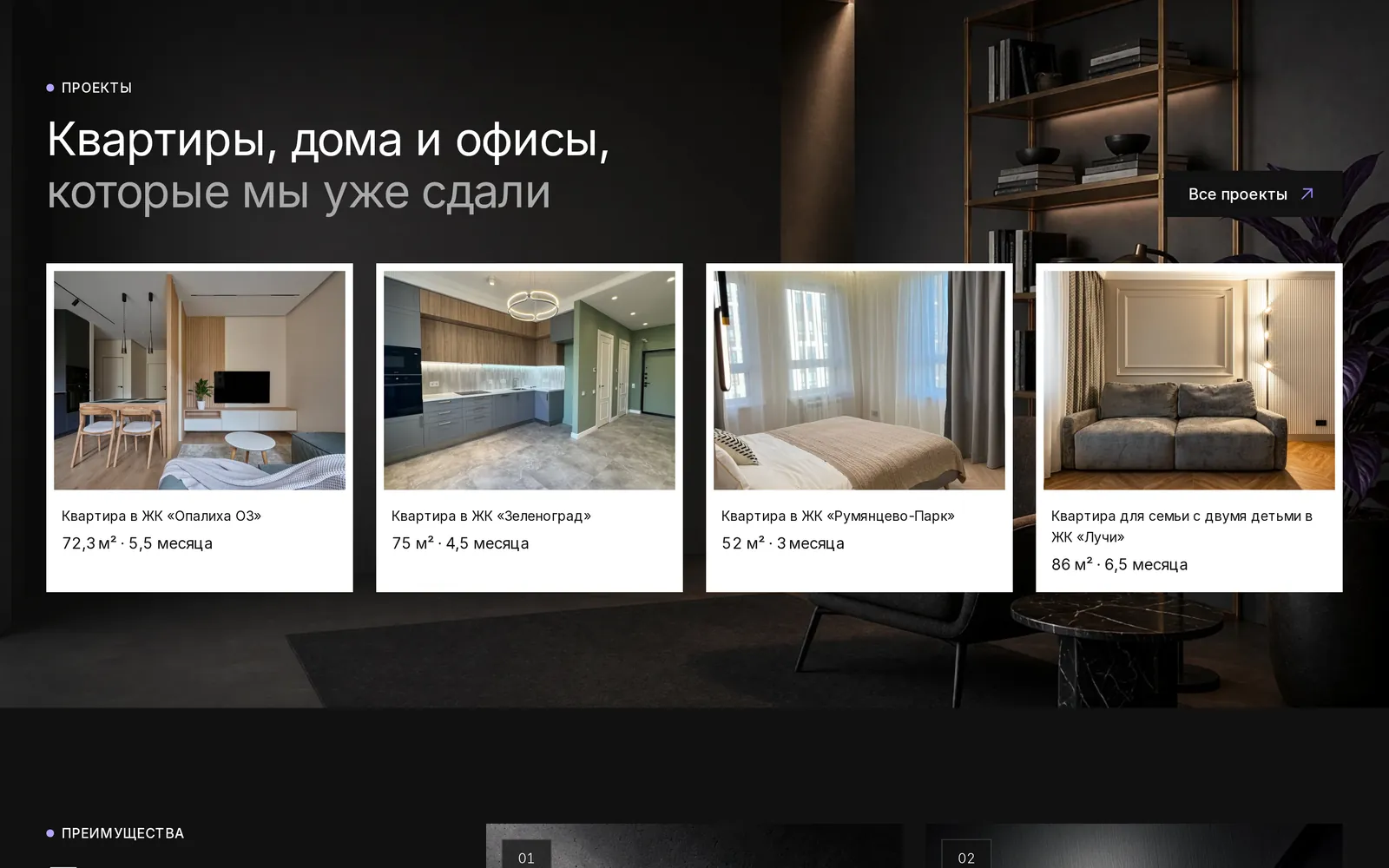
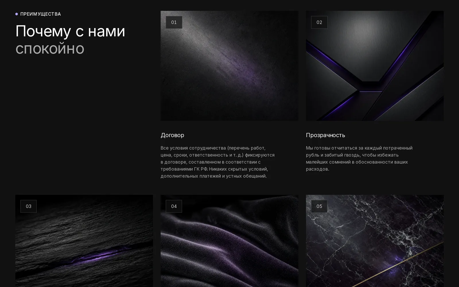
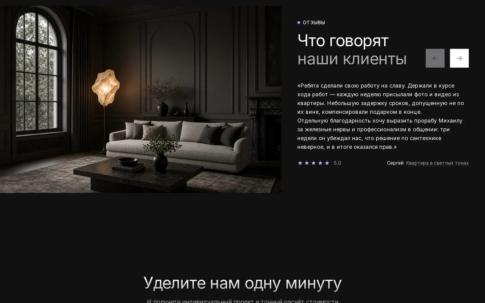
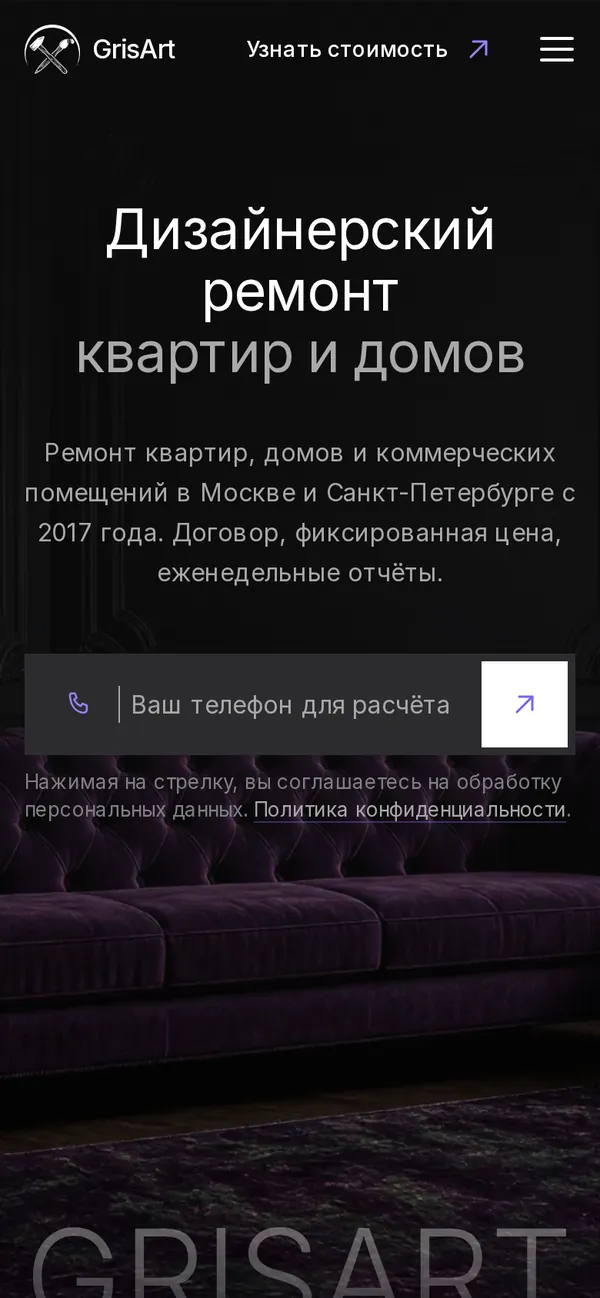
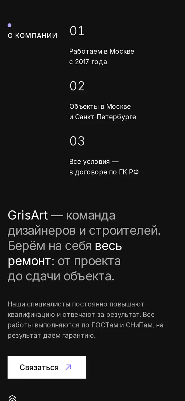
We chose a deep dark palette with a violet accent and large typography. The first screen holds a short promise and a phone field for an estimate. Then come company facts, six service lines, completed projects with size and timing, textured benefit cards and reviews.
A multi-page structure: services, projects, about, contact. Bilingual version, a single card system, responsive layouts, enquiry forms at the top and bottom of the page and clear guarantees in the “Why it feels safe” section.
SCREENS / DESKTOPEvery section
Every section
in its place.
SCREENS / MOBILEMade for
Made for
one hand.
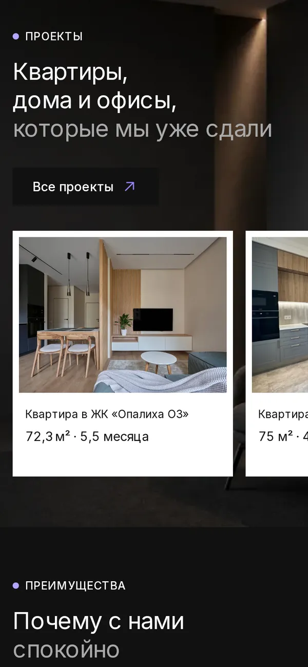
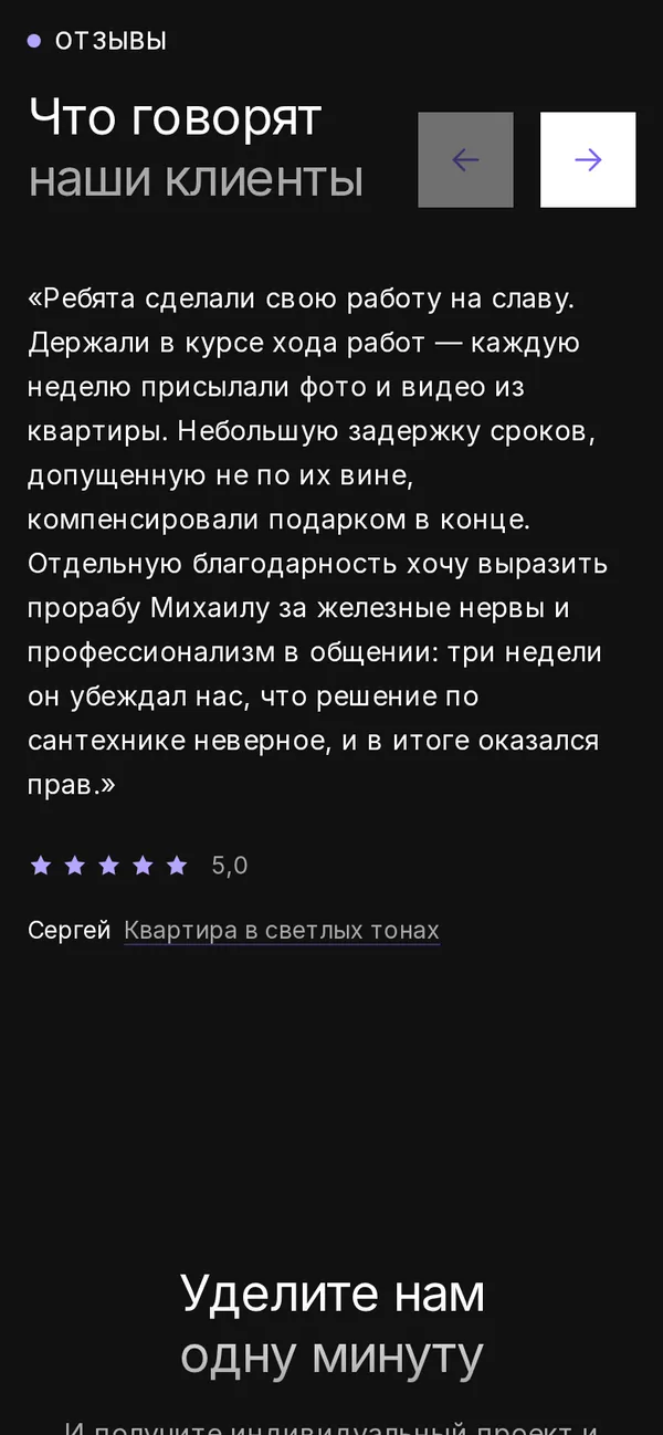
On a phone the essentials stay within reach: the estimate field on the first screen, services as cards and projects as a swipeable strip.
FULL PAGEThe whole page.
The whole page.
From first screen to footer.
Scroll inside the frame.

LET’S MAKE IT HAPPENStart by telling us a little about it.
Have an idea?
Let’s give it shape.